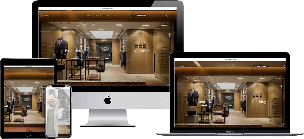
Why Responsive Website Design Matters
- Michael Fox

- Jan 13
- 4 min read
If you’re running a small business or startup, you’ve probably heard the buzz about responsive website design. But why does it really matter? I’m here to break it down for you in a simple, straightforward way. Your website is often the first impression customers get of your brand. If it doesn’t look great or work well on every device, you could be losing business without even knowing it!
Let’s dive into why responsive design is a game-changer for businesses and how it can help you stand out in a crowded market.
What Is Responsive Design and Why Businesses Need It
Responsive website design means your site automatically adjusts to fit the screen size of any device - whether it’s a smartphone, tablet, laptop, or desktop. This flexibility is crucial because clients are always on the move, using different devices throughout their day.
Imagine a potential customer browsing your site on their phone during their commute, then later on a laptop at work. If your website isn’t responsive, they might struggle to read text, click buttons, or navigate menus. That frustration often leads to them clicking away and finding a competitor instead.
Here’s why responsive design is essential for London businesses:
Mobile usage is huge: Over 60% of web traffic in the UK comes from mobile devices.
Google favours responsive sites: Search engines rank mobile-friendly sites higher, helping you get found.
Better user experience: Visitors stay longer and engage more when your site works smoothly.
Cost-effective: One site that fits all devices means less maintenance and updates.

Responsive design ensures your website looks great on all devices.
How Responsive Design Boosts Your Brand in London
Your website is your digital storefront. In completive world, you need to make a strong impression fast. Responsive design helps you do just that by:
Building trust: A professional, easy-to-use site shows you care about your customers’ experience.
Increasing conversions: Clear calls to action and smooth navigation encourage visitors to buy, book, or contact you.
Enhancing accessibility: Everyone can access your site easily, including those with disabilities or older devices.
Reflecting your brand identity: Consistent design across devices reinforces your brand’s look and feel.
For example, a local café in Banbury might see more online orders if their menu is easy to read on a phone. Or a startup in Oxford could attract more clients by showcasing their portfolio beautifully on any screen.
Key Features of Effective Responsive Design
Not all responsive websites are created equal. To truly benefit your business, your site should include these features:
Flexible grids and layouts: Content shifts smoothly to fit different screen sizes.
Optimised images: Fast loading times with images that resize without losing quality.
Touch-friendly navigation: Buttons and links are easy to tap on smaller screens.
Readable fonts: Text adjusts in size and spacing for comfortable reading.
Consistent branding: Colours, logos, and style remain uniform across devices.
If you’re working with a web design agency, ask them how they handle these elements. A good agency will explain their process and show examples tailored to local markets.

Designers focus on flexible layouts and user-friendly navigation for responsive sites.
How to Choose the Right Web Design Partner
Finding the right team to create your responsive website is just as important as the design itself. Here are some tips to help you pick the best fit:
Look for local expertise: A Local based agency understands the market and your audience.
Check their portfolio: See if they’ve worked with small businesses or startups like yours.
Ask about SEO: Your site should be built with search engine optimisation in mind.
Discuss budget upfront: Make sure their pricing fits your financial plan without hidden costs.
Request ongoing support: Websites need updates and tweaks, so find a partner who offers maintenance.
At Nex Design Agency, we specialise in helping small businesses and startups in the local community build professional, affordable websites that grow their brand and reach more customers. We focus on responsive design because we know it’s the key to success in today’s digital world.
Taking the Next Step with Responsive Website Design
If you haven’t already, it’s time to make your website responsive. Don’t let a clunky, hard-to-use site hold your business back. Whether you’re launching a new site or updating an old one, responsive design is an investment that pays off.
Remember, your customers expect a seamless experience no matter how they access your site. By prioritising responsive design, you’re showing them you’re modern, reliable, and ready to meet their needs.
If you want to learn more or get started, check out Web Design Agency | Nex Design Agency – Bespoke Solutions for expert help tailored to your business.
Your website is your digital handshake - make it a strong one!
I hope this helps you see why responsive website design matters so much. Ready to take your online presence to the next level? Let’s make it happen!
Mike Fox
Certified Wix Studio
Design Expert
14-01-2026


.png)

Comments